Showing posts with label CSS. Show all posts

Friday, March 29, 2013

Display Tags In A Dropdown Menu


People are increasingly using WordPress. Many are freash and know little about wordpress. Many are disappointed and many are previously blogger user but still people are looking for wordpress and its tools and tips and tricks. For new user it is difficult to understand CSS or to implement the CSS codes into wordpress. Don't worry here are some guidlines which if you follow you can easily implement these CSS codes into your wordpress. On the other side as a designers or developers (Experienced wordpress users), are really get in touch with WordPress coding. So here is an amazing CSS Code for them.
We recommend you to see related post to find more which you may don't have or may don't know about that. For more information just post in comment box below or feel free to contact us personaly


In theme folder, paste the following code to the functions.php file. If you don not have a functions.php file then first create this one.


<?php
function dropdown_tag_cloud( $args = '' ) {
$defaults = array(
'smallest' => 8, 'largest' => 22, 'unit' => 'pt', 'number' => 45,
'format' => 'flat', 'orderby' => 'name', 'order' => 'ASC',
'exclude' => '', 'include' => ''
);
$args = wp_parse_args( $args, $defaults );

$tags = get_tags( array_merge($args, array('orderby' => 'count', 'order' => 'DESC')) ); // Always query top tags

if ( empty($tags) )
return;

$return = dropdown_generate_tag_cloud( $tags, $args ); // Here's where those top tags get sorted according to $args
if ( is_wp_error( $return ) )
return false;
else
echo apply_filters( 'dropdown_tag_cloud', $return, $args );
}

function dropdown_generate_tag_cloud( $tags, $args = '' ) {
global $wp_rewrite;
$defaults = array(
'smallest' => 8, 'largest' => 22, 'unit' => 'pt', 'number' => 45,
'format' => 'flat', 'orderby' => 'name', 'order' => 'ASC'
);
$args = wp_parse_args( $args, $defaults );
extract($args);

if ( !$tags )
return;
$counts = $tag_links = array();
foreach ( (array) $tags as $tag ) {
$counts[$tag->name] = $tag->count;
$tag_links[$tag->name] = get_tag_link( $tag->term_id );
if ( is_wp_error( $tag_links[$tag->name] ) )
return $tag_links[$tag->name];
$tag_ids[$tag->name] = $tag->term_id;
}

$min_count = min($counts);
$spread = max($counts) - $min_count;
if ( $spread <= 0 )
$spread = 1;
$font_spread = $largest - $smallest;
if ( $font_spread <= 0 )
$font_spread = 1;
$font_step = $font_spread / $spread;

// SQL cannot save you; this is a second (potentially different) sort on a subset of data.
if ( 'name' == $orderby )
uksort($counts, 'strnatcasecmp');
else
asort($counts);

if ( 'DESC' == $order )
$counts = array_reverse( $counts, true );

$a = array();

$rel = ( is_object($wp_rewrite) && $wp_rewrite->using_permalinks() ) ? ' rel="tag"' : '';

foreach ( $counts as $tag => $count ) {
$tag_id = $tag_ids[$tag];
$tag_link = clean_url($tag_links[$tag]);
$tag = str_replace(' ', '&nbsp;', wp_specialchars( $tag ));
$a[] = "\t<option value='$tag_link'>$tag ($count)</option>";
}

switch ( $format ) :
case 'array' :
$return =& $a;
break;
case 'list' :
$return = "<ul class='wp-tag-cloud'>\n\t<li>";
$return .= join("</li>\n\t<li>", $a);
$return .= "</li>\n</ul>\n";
break;
default :
$return = join("\n", $a);
break;
endswitch;

return apply_filters( 'dropdown_generate_tag_cloud', $return, $tags, $args );
}
?>

Now open the file where you want the list to be displayed and paste the following code:

<select name="tag-dropdown" onchange="document.location.href=this.options[this.selectedIndex].value;">
<option value="#">Tags</option>
<?php dropdown_tag_cloud('number=0&order=asc'); ?>
</select>

You are done! Thank you.

Friday, March 8, 2013

CSS Code To Flip an Image


Here is the CSS code which helps you to flip the images. For example having only one graphic for an "arrow", but flipping it around to point in different directions.

Question related to this topic:

Can this trick be applied to background images?
The answer is Yes! It can be applied to background images.

Actually it can be applied to background images and it works fine with the following:
-Fire Fox
-Chrome
-IE

The problem related with IE is, When you will use the IE it will show the “ActiveX” bar at top of your page and asks you to allow the Blocked Content or otherwise it will only show the none-flipped background image. I know this is very annoying but this what it is.
So When it asks to allow you simply allow it.

Demo:

Unflipped Image:

Flipped Image:


Now here Comes the Code:

***---CSS---***

img {
        -moz-transform: scaleX(-1);
        -o-transform: scaleX(-1);
        -webkit-transform: scaleX(-1);
        transform: scaleX(-1);
        filter: FlipH;
        -ms-filter: "FlipH";
}


Bouncy Animated Loading Animation


This CSS trick is amzanig and i am sure you will like it. Just another coolest thing with CSS3 animations. If you are worried about super deep browser support, use a GIF file.
Well, I guess you are using a good browser. If i am wrong then please uninstall it and install and use a good/better one. Thank You!


***---HTML---***

<div class="loader">
    <span></span>
    <span></span>
    <span></span>
</div>

***---CSS---***

.loader {
    text-align: center;    
}
.loader span {
    display: inline-block;
    vertical-align: middle;
    width: 10px;
    height: 10px;
    margin: 50px auto;
    background: black;
    border-radius: 50px;
    -webkit-animation: loader 0.9s infinite alternate;
    -moz-animation: loader 0.9s infinite alternate;
}
.loader span:nth-of-type(2) {
    -webkit-animation-delay: 0.3s;
    -moz-animation-delay: 0.3s;
}
.loader span:nth-of-type(3) {
    -webkit-animation-delay: 0.6s;
    -moz-animation-delay: 0.6s;
}
@-webkit-keyframes loader {
  0% {
    width: 10px;
    height: 10px;
    opacity: 0.9;
    -webkit-transform: translateY(0);
  }
  100% {
    width: 24px;
    height: 24px;
    opacity: 0.1;
    -webkit-transform: translateY(-21px);
  }
}
@-moz-keyframes loader {
  0% {
    width: 10px;
    height: 10px;
    opacity: 0.9;
    -moz-transform: translateY(0);
  }
  100% {
    width: 24px;
    height: 24px;
    opacity: 0.1;
    -moz-transform: translateY(-21px);
  }
}

 Reference URL 

Absolute Center (Vertical & Horizontal) An Image/Photo


Here are some usefull techniques and guidance of CSS and one HTML code for Absolute Center (Vertical & Horizontal) An Image.

Caution:
The problem here is that if you will re-size the browser you cannot scroll to the top. For example: if you have a menu on top you cant view it.


CSS background-image Technique:


html { 
   width:100%; 
   height:100%; 
   background:url(logo.png) center center no-repeat;
}

Table technique:

***---CSS----***
html, body, #wrapper {
   height:100%;
   width: 100%;
   margin: 0;
   padding: 0;
   border: 0;
}
#wrapper td {
   vertical-align: middle;
   text-align: center;
}
***---HTML---***

<html>
<body>
   <table id="wrapper">
      <tr>
         <td><img src="logo.png" alt="" /></td>
      </tr>
   </table>
</body>
</html>


CSS + Inline Image Technique:

img {
   position: absolute;
   top: 50%;
   left: 50%;
   width: 500px;
   height: 500px;
   margin-top: -250px; /* Half the height */
   margin-left: -250px; /* Half the width */
}
It is also possible to do this using div’s and CSS:

<div class="contendor" style="border: 1px solid green; margin: 0; padding: 0; display: table">
<div class="contendor-secundario" style="border: 1px solid yellow; margin: 0; padding: 0; display: table-row">
<div class="columna1" style="border: 1px solid red; margin: 0pt; padding: 0pt; vertical-align: middle; display: table-cell">columna uno</div>
<div class="columna2" style="border: 1px solid blue; margin: 0; padding: 0; display: table-cell">column two,
which is quite higher than the previous one,
also,  we can make even higher
and column 1 is no longer centered
</div>
</div>
</div>

Accessibility/SEO Friendly CSS Hiding

Photo Source: www.iconfinder.com


#content {
    position: absolute;
    top: -9999px;
    left: -9999px;
}

'' Removes an item from the page, without affecting page flow or causing scrollbars. Much better than display: none; or even visibility: hidden; ''


Caution:

This is bad practice! as Google will simply remove your site from their search results altogether. Google has stated time and time again thruough webmaster central for web designers NOT to position elements off the screen. If you are going to need to hide an element use the “display: none;” property, and not “display: hidden;”. If Google penalizes your site for hiding content they will notify you if you have a webmaster tools account, otherwise you may get no notice at all of a manual action taken against your site. If you are penalized, simply submit a request for reconsideration to Google, and explain why you are using the “display: none;” property and prove its for legitimate use, such as having the elements appear with alternate sizes depending on the resolution of the users screen, hence “media queries” in CSS.

For SEO purpose, be aware that this technique could lead you to be blacklisted. The same reason as above. You can hide a mnu item, stuff like that, but if you hide a div full of h1 and anchors just for SEO purpose, google may blacklist list you.

So use with caution or at your own risk. We are not responsible for any thing. Thank You!

Wednesday, March 6, 2013

15 Fresh Resources for Developers and Designers

You will find many resources for designers and developers and of course you wouldn’t always know which one is the best to put to use. That’s where we come in. We have compiled this particular list of 15 fresh resources for developers and designers in order to help you out. These resources have been compiled after scouring the internet for you and these are the best of the best. We will keep updating you regarding more resources as we find them. We hope this list proves helpful and you enjoy the read. Your feedback is always welcome.

Also Read : 30 Fresh Useful Resources for Developers and Designers

COLOR SCHEMES


If you guys are programmers are using either Sublime Text 2 or Textmate for editing code then you might want to consider this particular tool called color schemes. This package is created by Dayle Rees and I am sure looking at the picture gives you the picture of what this package does. You have around 30 different color schemes that you can use to your liking. It does make things easier.


This particular tool is a jQuery plugin and it helps you to add accented characters very easily. You might already be familiar with the concept of long press if you use android devices because they use that function in for almost every command. If you hold down the ‘a’ or ‘e’ key, additional characters popup (as can also be seen in the picture). This can help you save a lot of time and it also makes it easier for you to find ‘special’ characters.

LAYOUT ICONS


There are many different websites that offer you different sets of icons that might include social media icons or even general user-interface icons but this is a little different. This package is created by Ales Nesetril and these icons represent the layout of the web. I am pretty sure you guys can make sense of that just by looking at the icons. These icons are bound to come in handy if you are building a content management system.


We are pretty sure that you are aware of the new features of CSS3 and their application in web animation. Adobe edge was recently introduced and with it comes Adobe Edge Animate. The software is essentially similar to Adobe Flash although the only difference is that it creates animations for the web and you know exactly how easy Adobe makes things so you can pretty much say that web animation just got easier. It is still free so you might want to get your hands on it  soon.


Have you ever visited the website called Reddit? If so then it’s all good but if you have not then you might want to visit and see if it appeals to you or not? Well, if it does than the good news is that you can build a similar website using telescope. This real-time social news framework is built upon Meteor which is equipped with many different features including but not limited to real-time updating, invite-only access, notification and e-mail authentication.


Just reading the name we are pretty sure you guess as to what the functionality might be, not to mention looking at the picture. It is for designers to draw their ideas as soon as it hits their heads. There are a few typography elements you can use and general shape to give your idea an outline. You can create several documents and thereby adjust their width and height etc.


We are certain that you understand exactly how important and used scalable vector graphics are when it comes to websites for which purpose there are many different editors available for you to edit your scalable vector graphics. One such tool is method draw. The best part about this application is that is web-based so you don’t need to download and install it. The best part about this tool is that it is free.


This particular application is a JavaScript library which helps you to build web charts that are built upon D3.js. These charts are formed with HTML, SVG (Scalable Vector Graphics) and CSS. As of now, there are two types of charts available for you to choose from; bar and line graph. You can very easily customize these two graphs using CSS and of course that all depends upon you.


The use of computers to check the e-mail is very minimum according to statistics and everyday more and more people are shifting to the mobile phone medium in order to check their e-mails. For you to check your e-mails on your phone it is imperative for you to receive them too. You can use these responsive e-mail templates and there’s five different ones you can choose from.


It is a fact that creating a responsive e-mail might prove to be a bit challenging but it still is nothing compared to creating a responsive table. It is very tricky as we are sure you must know. There are many solutions available to make the process wee bit simpler one of which is Footable. It is a jQuery plugin that should make you tables responsive and too a bit easily.


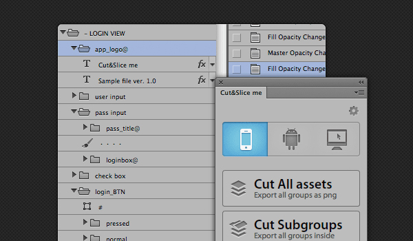
Cut and Slice is a free Photoshop plugin which should allow you to slice your Photoshop layers in order for you to use them in web and it should be able to do that in seconds. It is free but it is only available for CS6 so the rest of you might have to wait. You guys are aware of how difficult and time-taking the job of slicing layers for web can be and especially so if you have millions of them.


If you are using jQuery, folding effect shouldn’t be that big of a deal to you when it comes to web development. You have many free plugins available to you that are able to create such visuals so what is different with PFold? Well, you know how you fold the paper and unfold it back to its original straight or change the shape and everything? PFold sort of does the same thing. You can even aim the fold direction to wherever you want so it’s more interesting.


If you have visited the website called Pinterest then you are sure to know that they present their information in the layout of a grid. For those of you who don’t know, Pinterest has to do with social media. Anyway, using this little tool you can create similar grid layouts. This plugin is actually responsive so it makes the job way better than your average tools.


There are many different functions introduced with CSS3 and even though they are awesome, for example the transformation and transition function; they tend to get a little complex. In order to ease things a little, Adem Ilter has created this tool called Liffect. It adds unbelievably cool effects including Star Wars effects. Can it get more awesome then Star Wars? I guess not.


This is a very light jQuery puglin which helps you create 3D dropdown effect. The name should make it clear that the effect actually looks like Makisu it is folds down. For those of you who don’t know, Makisu is a mat which is woven from bamboo and cotton string which is used in food preparation. It is usually how sushi is rolled. The 3D effects offered by Makisu are built upon CSS 3D transformation so you should only be able to see these effects on modern updated browsers.


This post is adopted from:
Post Source: Reference Link